


The Comeback Candy
[ Identity / Packaging ]
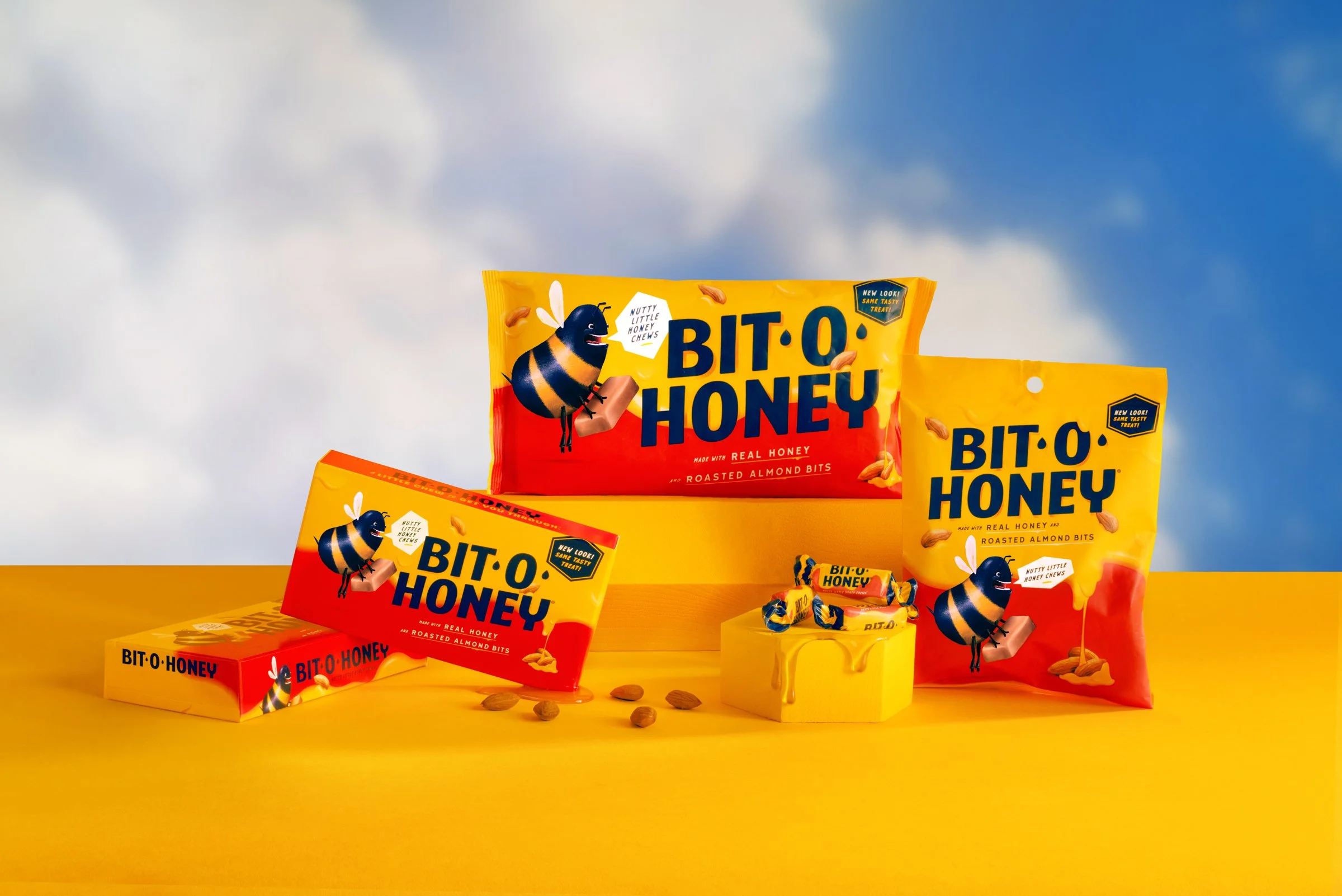
Bit-O-Honey had spent nearly a century earning affection. But its packaging was showing its age. Research pointed to a growing audience of those looking for its subtly sweet taste and the identity needed to give those people a reason to look again.
We built the refresh around that quieter kind of indulgence. I designed the packaging, illustrated the bee and ingredients, created two custom typefaces, and art directed the photography. Every detail brought the same idea into focus: a classic candy with a little more grown-up appeal. Plenty of character. No need to shout.
Brand: Bit-O-Honey
Agency: Young & Laramore
CD/AD/Design: Zac Neulieb
Writer: Kait Wilbur
Site Design: Baker Wright
Packaging


Web
With the launch of the new revamped packaging, we created a single-page, long-scroll experience to drive consumers and candy industry people from desktop, mobile and tablet to learn about the reintroduction of this classic candy. We also gave new meaning to the phrase “sticky header”.
Process
The bee
The Bit-O-Honey bee was in a desperate need of a face lift. Or soul lift, if that’s a thing. You can see the original iteration and version of the bee we ended up choosing had a set of crazy eyes and mouth full of teeth that evolved along the way into what ended up on the packaging.

Design exploration
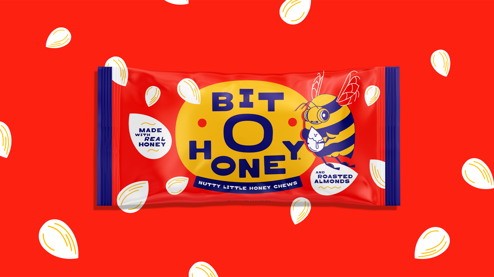
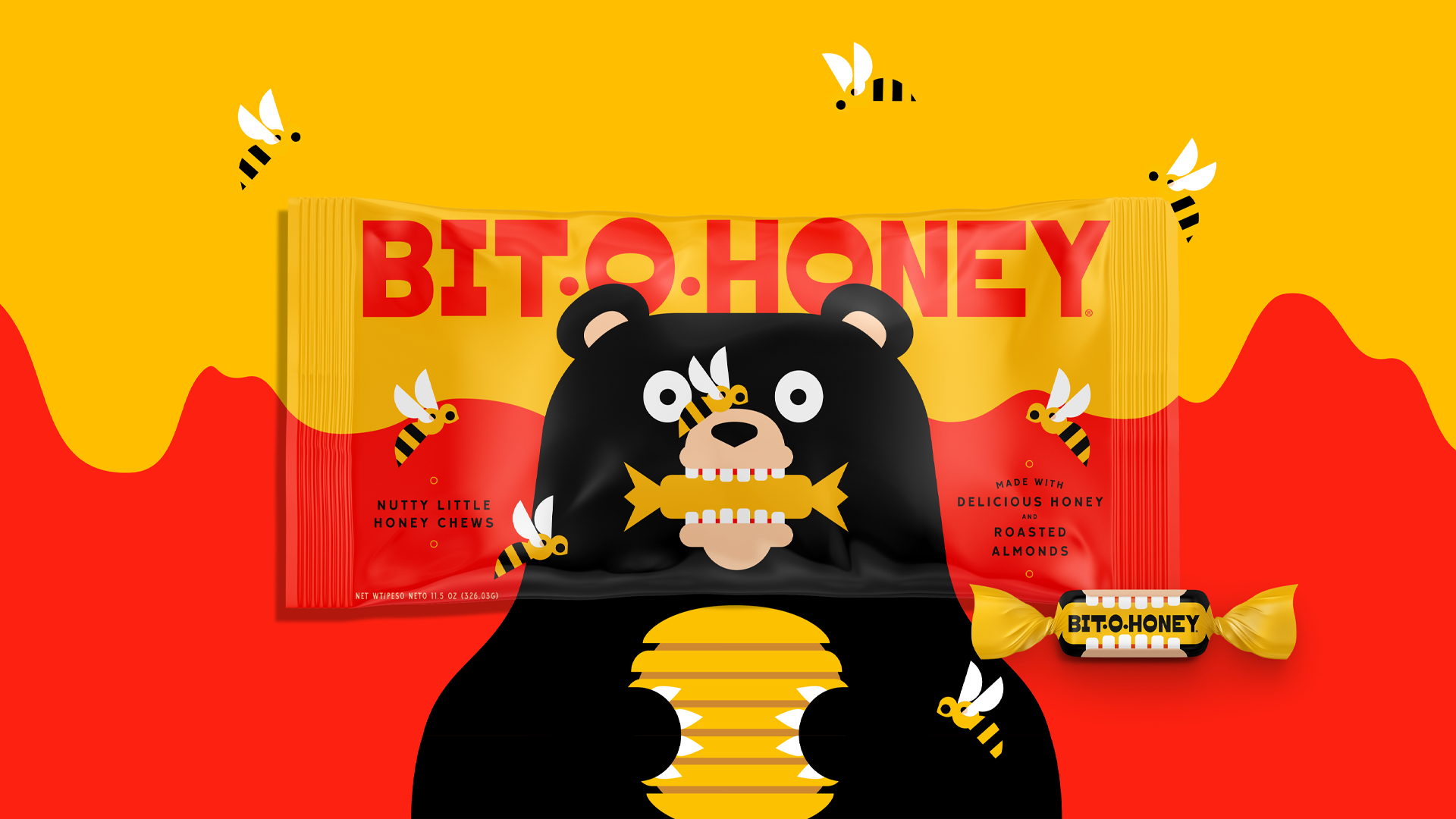
The wide range of exploration I did spanned different visual tones and styles—trying on what aesthetic worked best to communicate the idea of the brand tagline: a little chew to get you through.
What if the bee was slightly crazier? What if the bee was a supporting character instead? All questions that led down different paths to explore.
Final Rendering
